When the iPhone was launched in 2007, the mobile web has continued to grow year on year.
How important is mobile optimisation?
The term mobile web refers to websites that are accessed through mobile devices and are mobile friendly, these websites are usually created on a sub-domain (m.example.com) or responsive to the screen size. In 2017, the use of apps as a mobile website is getting quite common.
Up until now, you might have been OK just making sure your website was usable on a mobile device. Unfortunately, that will not be the case soon.
You may have noticed when Googling on your phone, you see website’s labelled “Mobile-Friendly” in the search results. This is because they will favour mobile friendly results as the user-experience is much greater on a responsive/mobile website.
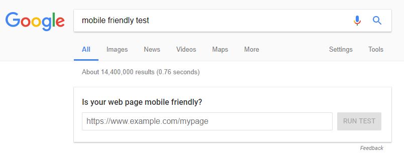
You can test if your website is mobile friendly.
This test will also give you recommendations on how you can improve the speed and user experience on your website.
Mobile First Index
With the current state of Google, there is one index which is used for all devices. Searching on mobile may give slightly different results due to query matching but generally speaking, these websites have those positions because the desktop/mobile index is shared.
In the near future, desktop and mobile will be separate.
This means you can no longer rely on your rank for desktop to rank in the mobile index, aside from the current ranking factors, your website will also need to have optimise for:
- Fast loading time
- Low page size
- Touch elements spaced correctly
- NO pop-ups
- Preferably use responsive over sub-domains
- Simplified content (AMP)
- Pleasant user experience
The websites that utilise this aspects will have a jump on competitors that don’t when the mobile index is launched. Gary Illyes has said the launch is more likely to be in 2018:
“We don’t have a timeline for the launch yet,” Illyes said. “We have some ideas for when this will launch, but it’s probably many quarters away. Our engineers’ timeline was initially end of 2017. Right now, we think more 2018.”
What happened to tablets & iPads?
From what I have seen on many websites, the devices are nearly split 50/50 with mobile to desktop. Tablet devices are no longer a popular option as mobile devices are utilising larger displays – it is not necessary to have this intermediate device.
This doesn’t mean you can forget about tablets when creating your website, a lot of tablet-like devices may be bracketed as desktop due to the screen size/browser/OS. You still need to make sure your website looks good and works on these display types, be aware that if they are touch screen – your menu and other functions can still work with on touch commands.
Marcus Miller wrote a great piece about this on Search Engine Land covering everything you need to know.


